
01.
Context
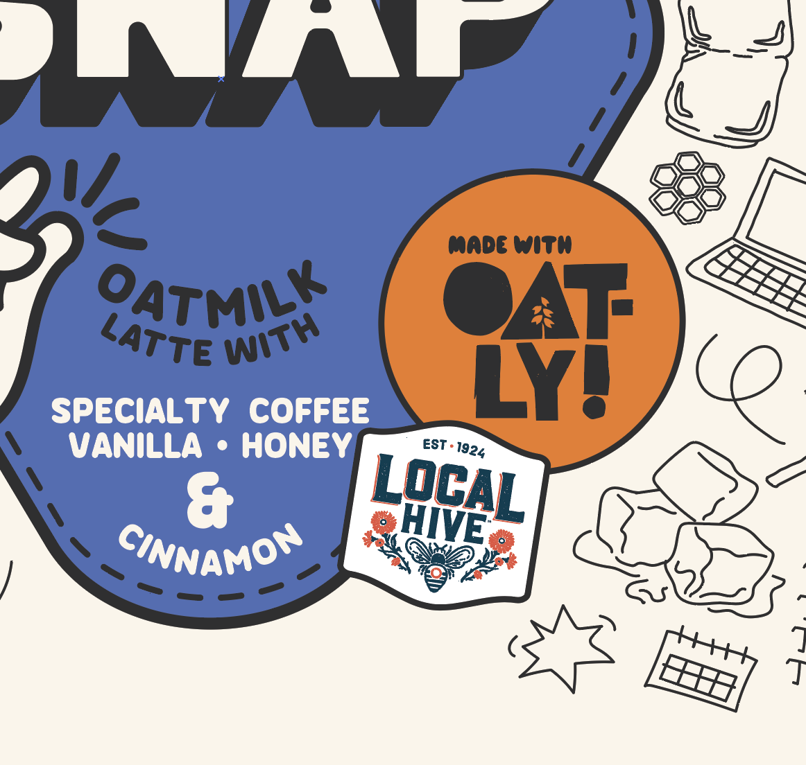
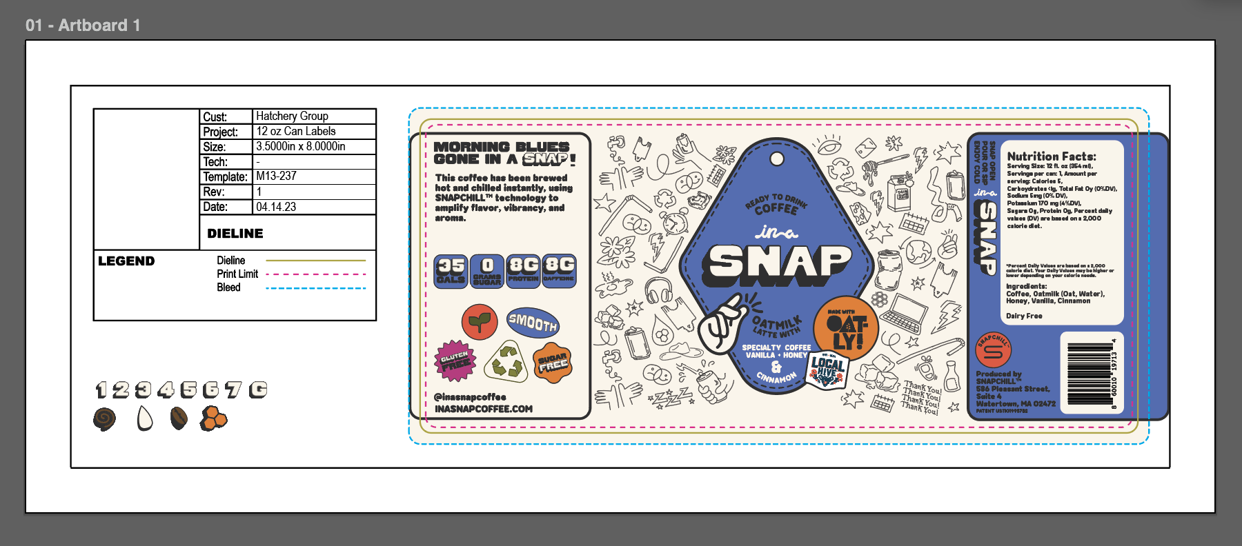
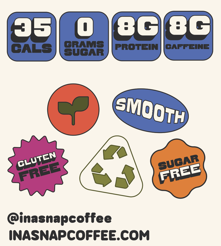
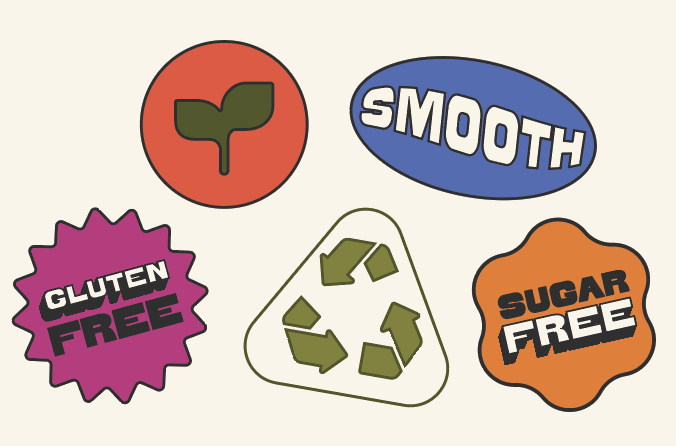
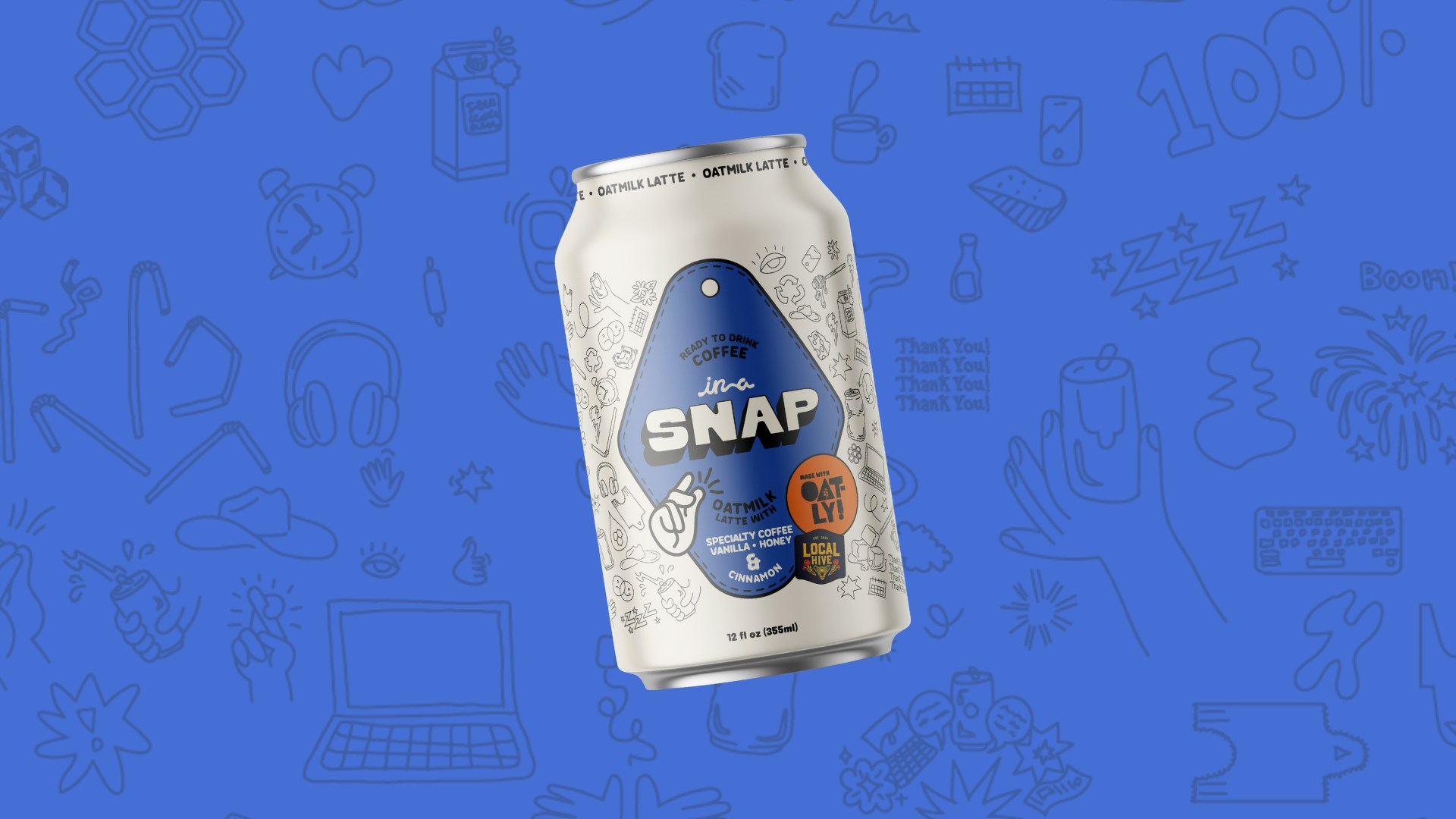
In a Snap was developed as a ready-to-drink canned coffee that needed to feel unmistakably Oatly while standing out in a crowded refrigerated set. The packaging had to balance brand personality, retail clarity, and real-world production constraints all while communicating the product’s value quickly at shelf. The project moved from concept to shelf in three months, requiring tight collaboration and fast decision-making.